
Dhoot
Overview
Dhoot Fragrance - Where ancient ritual meets contemporary design. A heritage incense brand wanted packaging that felt as sacred as the product inside, yet fresh enough to stand out on a modern shelf. We built a visual world that honours tradition without being trapped by it.
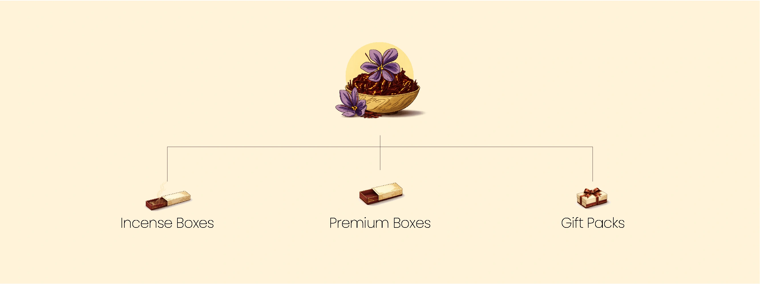
One ingredient at the root. Three product worlds branching from it
Saffron - one of India's most precious, most storied ingredients, sits at the heart of the Dhoot Fragrance identity. From that single point of origin, the brand extends into three distinct product formats, each designed for a different moment and a different consumer need. The architecture was not just a business decision; it was a design one. Every tier had to feel like a natural expression of the same brand, elevated or everyday, gifted or kept for oneself.
The colour tells you what's inside before the name does
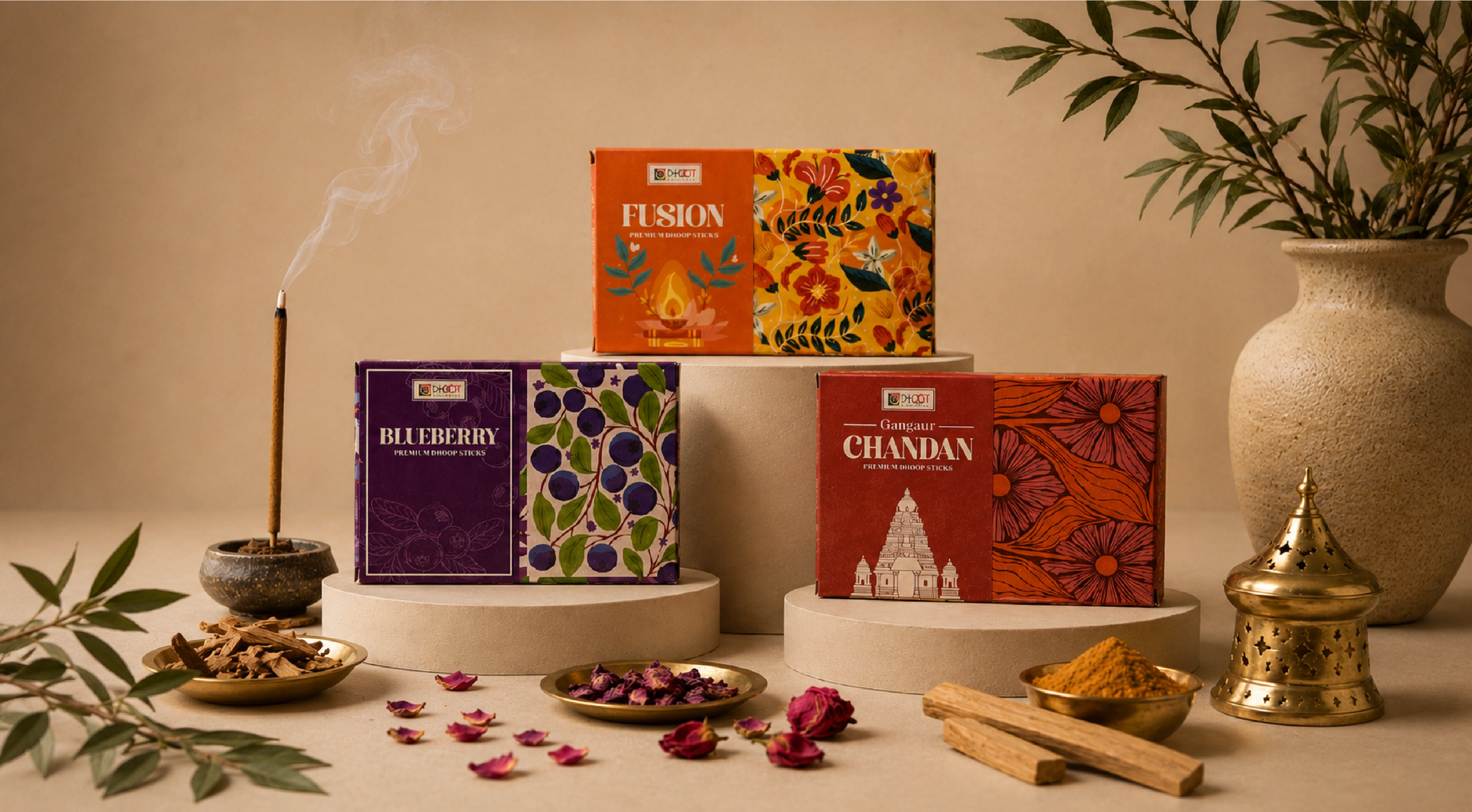
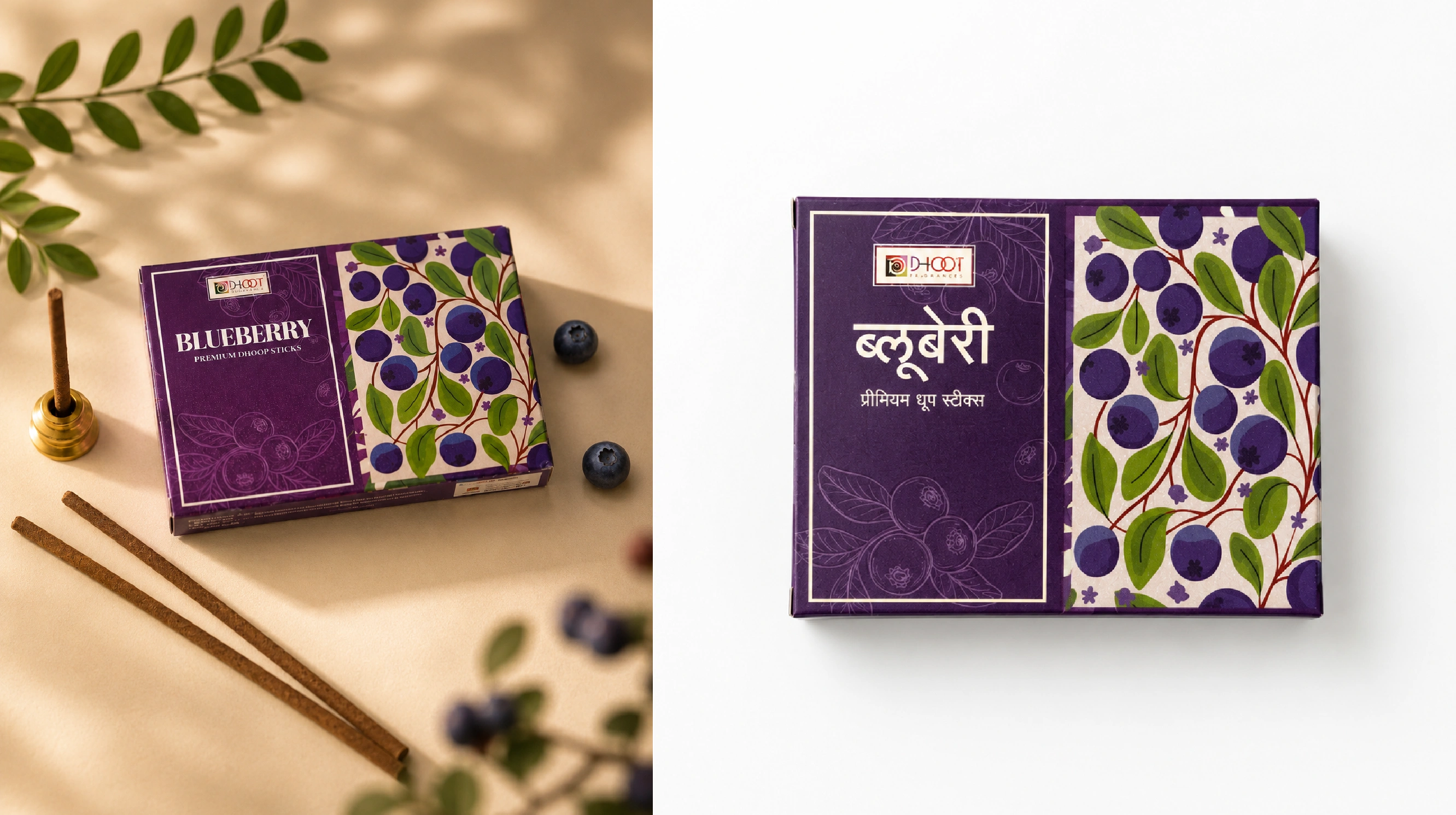
The palette for each variant was not chosen for shelf contrast alone — it was chosen for sensory truth. Deep amethyst for Blueberry: cool, fruity, slightly mysterious. Burnt amber for Fusion: earthy and celebratory. Terracotta for Gangaur Chandan: grounded, smoky, devotional. Every colour decision maps to the fragrance's emotional register, making the whole range feel considered rather than colour-coded.
Individual expressions, one unmistakable family
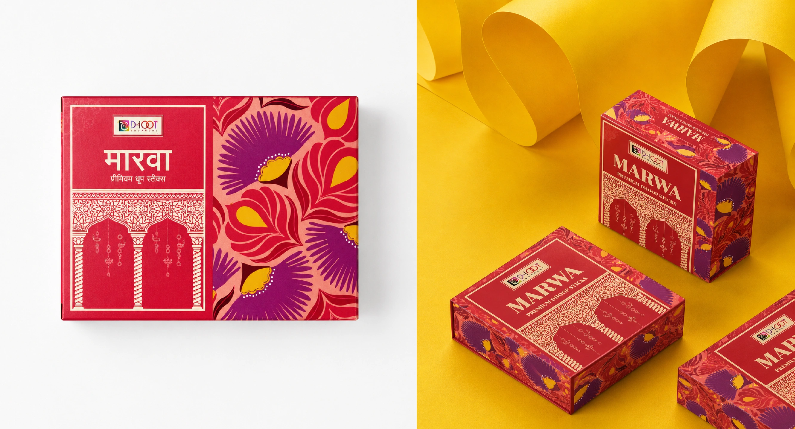
Three variants in frame : Blueberry, Fusion, and Gangaur Chandan and you know immediately they belong together, yet each holds its own. The dual-panel box structure acts as the constant: label-side for name, colour, and architectural line-art; pattern-side for botanicals or florals. Across Incense Boxes, Premium Boxes, and Gift Packs, this structural grammar scales without losing its character, the same logic at every format and price point.