Makhana
Overview
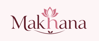
A logo that speaks before the pack does. The Makhana lotus motif was not decorative, it was intentional. Rooted in Indian culture and tied to the product's origins, every design element was considered with the brand story in mind. The wordmark, the lotus, the gentle curve beneath, together they signal nature, purity, and mindful snacking without a single word of copy
- Multiple logo rounds with client inputs at each stage, refining until the mark felt true to the brand's values
- A palette selected for warmth, appetite appeal, and shelf standout across retail environments
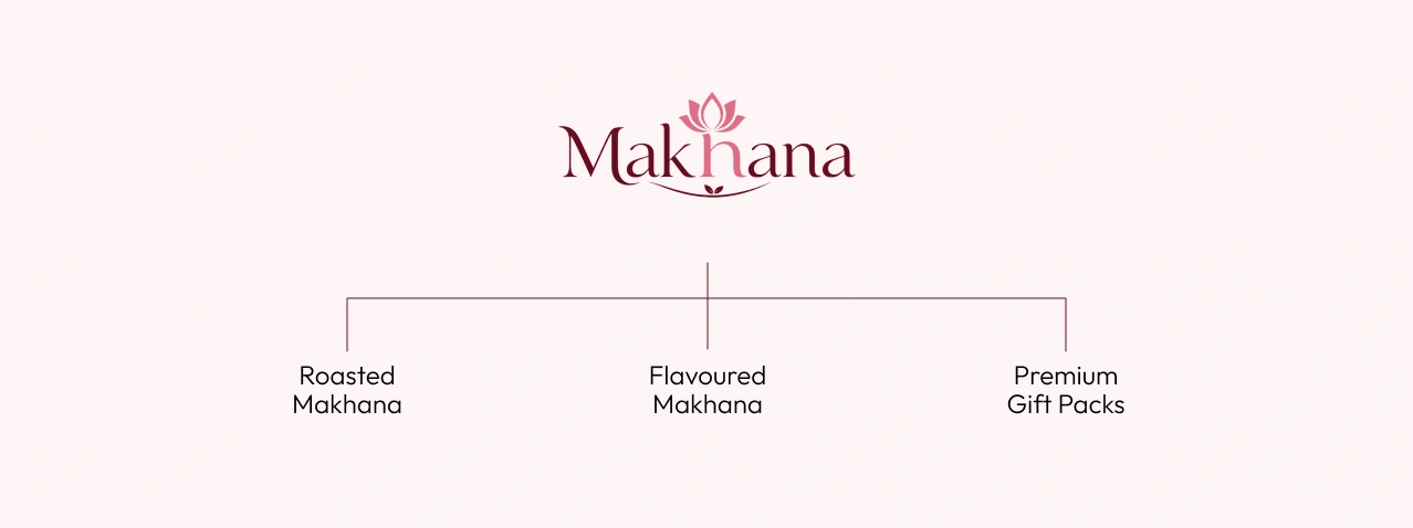
- Brand architecture defined across three product lines: Roasted Makhana, Flavoured Makhana, and Premium Gift Packs.
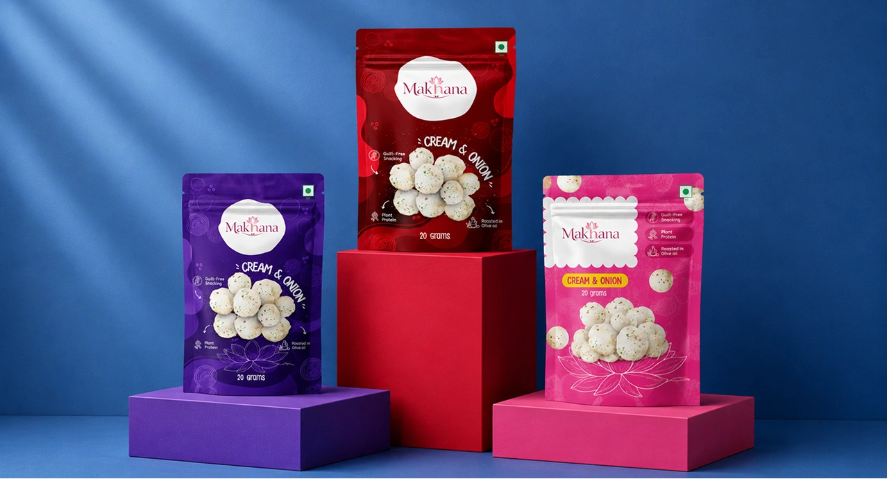
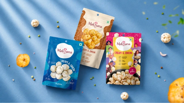
One brand. Three colour stories. Unmistakably one family.
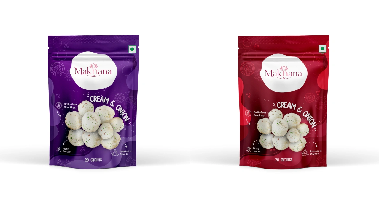
The packaging needed to work two ways simultaneously — each variant had to own its own shelf space with a distinct colour personality, yet the range had to read as a coherent family when placed side by side. We achieved this through a consistent structural layout, shared illustrative language, and a carefully controlled palette that diverges just enough.
Every detail on the pack earns its place
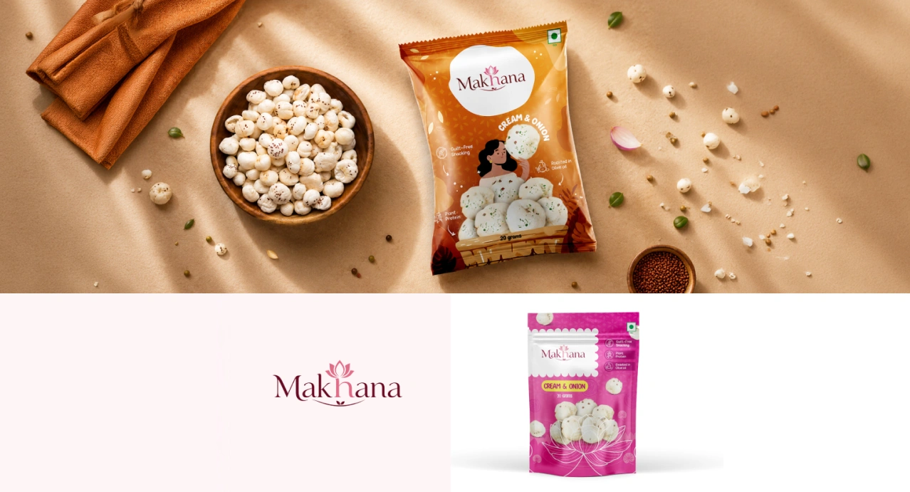
The illustrated characters - a woman enjoying a makhana, festive figures, the lotus bloom, were not stock art or filler. Each was drawn to reflect a slice of the consumer's world: real moments, real warmth, real snacking occasions. Claims like "Guilt-Free Snacking", "Plant Protein", and "Roasted in Olive Oil" were woven into the layout as visual anchors, not afterthoughts
Designed through listening, refined through rounds
Good packaging is not designed in one pass. The Makhana project moved through discovery sessions, brand story workshops, and multiple design rounds - each shaped by the client's vision and our team's craft. We brought the structural thinking, the colour logic, and the illustrative detail. The client brought context, conviction, and a clear sense of who they were building for. The result was neither ours nor theirs alone.
The right packaging does not describe the product, it makes you want to reach for it.